Why your logo needs to work everywhere
Your logo appears in more places than it ever has. Desktop screens, mobile apps, social media avatars, smart watches, billboards, business cards, promotional pens. It’s impossible to use the same version everywhere without losing something. A responsive logo isn’t about creating multiple identities, it’s about designing one identity that works in every context without falling apart.
The reality of modern brand presence
The one-size-fits-all logo is a relic of the past. What works on a billboard becomes an illegible mess on a favicon. What looks sharp on your website header gets lost when scaled down to a social media profile picture. The details that make your logo distinctive on large formats become visual noise at small sizes.
What was once seen as an advertising faux pas is now being recognised as a best practice. The old “never change the logo” mentality doesn’t work when your brand lives across dozens of different touchpoints, each with different size and resolution requirements. Disney doesn’t use the same logo complexity on their app icon as they do on their cinema signage, and neither should you.
What makes a logo actually responsive
A responsive logo isn’t several different logos. It’s a system. Responsive logo design involves crafting logos that dynamically adjust to various device displays and resolutions while maintaining brand recognition. This means designing with scalability from the start, not retrofitting later.
The approach is simple: start with the smallest version first. What’s the absolute minimum needed for recognition? Usually it’s a simplified mark, a single letter, or your icon without the wordmark. Then build up from there. Your full logo for large formats, a mid-complexity version for standard applications, and that stripped-back version for tiny spaces.
Eliminating unnecessary elements makes it easier for your audience to connect with your brand quickly and efficiently. This isn’t about dumbing down your identity, it’s about clarity. Google’s “G” is instantly recognisable. So is Nike’s swoosh. These work because the brands designed for adaptability, not just aesthetics.
Get in touch for a responsive logo audit
We’ll audit where your logo appears. Screenshot every touchpoint, website header, mobile app, email signature, social media profiles, print materials, promotional items. We’ll look at which versions work and which fail. Then design a responsive system: full logo, simplified logo, icon-only version.
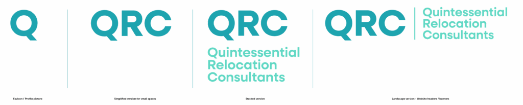
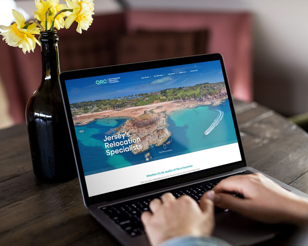
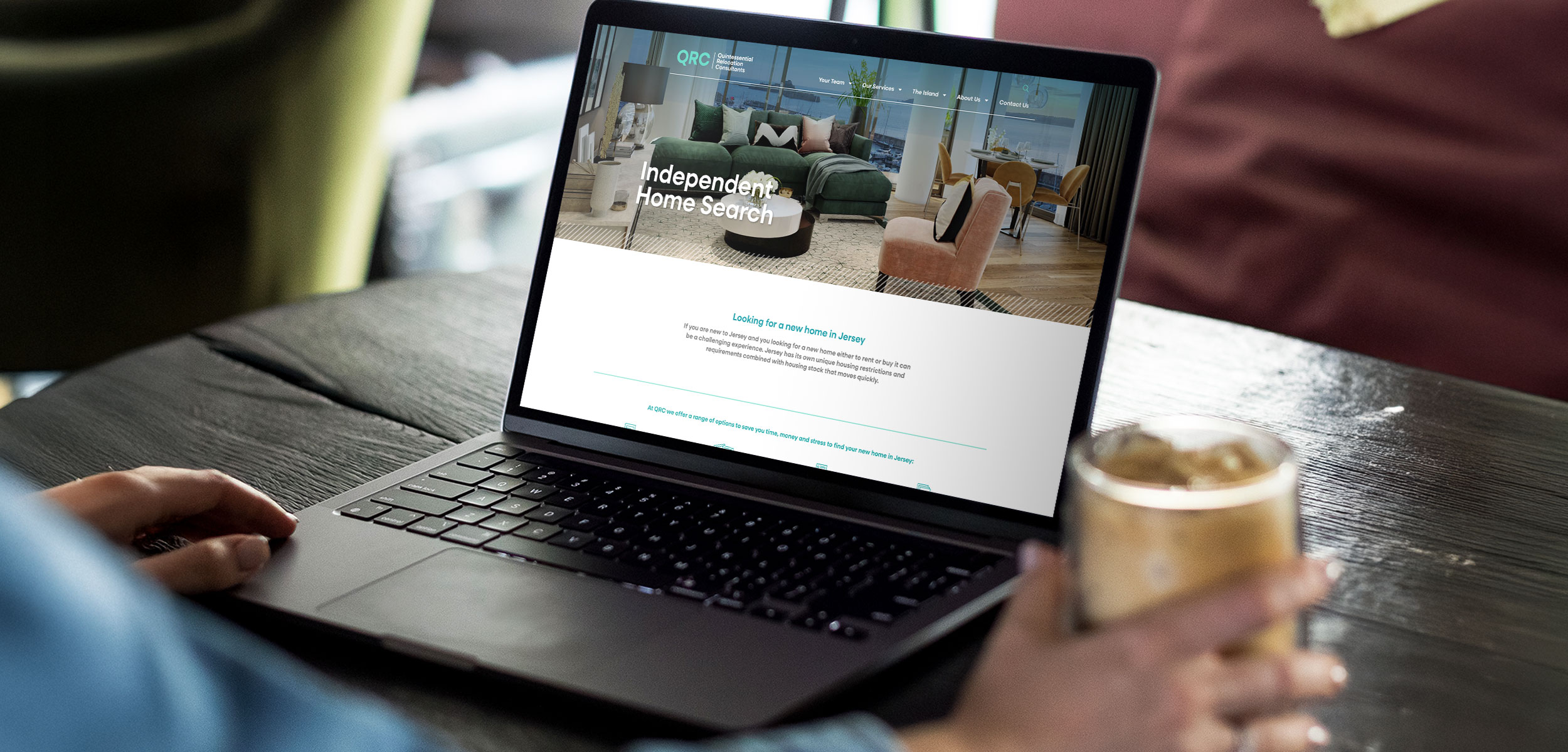
Here’s an responsive logo we’ve recently created for Quintessential Relocation Consultants (QRC), everything from the favicon logo, to a simplified version of the full logo, stacked and landscape versions for different spaces. Having a tight logo system allows the logo mark to work and be recognisable from the Q to the full logo iteration.